SwilkenTravel

The brand book

Everything that carries the crest.

What Swilken Travel looks like, and the reasoning behind every choice, so that a guest meets the same company at the airport kerb, on the first tee and at the hotel door.

Why it looks this way

At this level, premium is what you leave out.

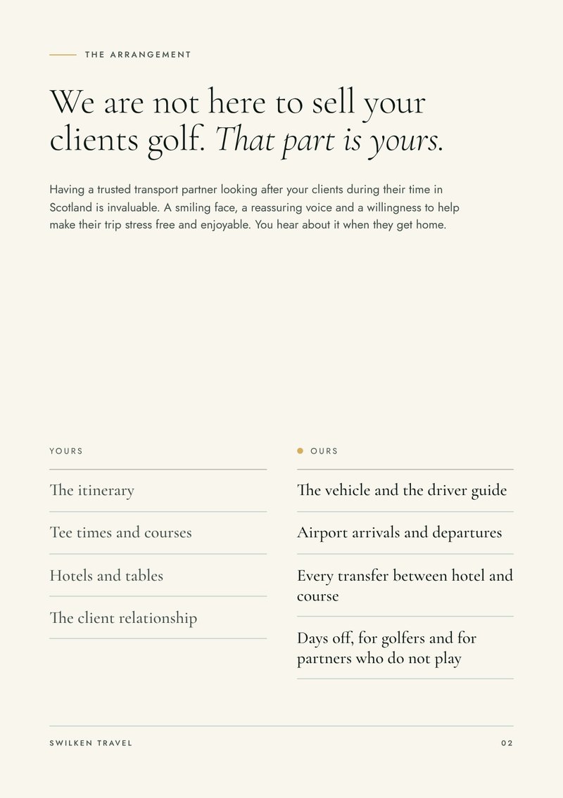
Our guests have flown a long way to play the most famous courses in golf, and the operator who sent them has put their own name on the trip. Nothing we put in front of either of them should shout.

So the brand is built the way a good members' club is built. One emblem, a short palette, honest materials and plenty of room. Anyone can add gold. Very few have the confidence to use this little of it.

  • One emblem

    The crest is the only logo. It is the same on a cap, a coach and a contract, so it is recognised without ever being explained.

  • A short palette

    Five colours, all taken from the links and the coachwork. Gold is used like thread, in fine lines and small marks, never in blocks.

  • Real materials

    Every piece is specified as something you can hold: thread, foil, hard enamel, leather, uncoated paper. If it cannot be made well, it is not made.

  • Room around everything

    Wide margins, large type set light and one idea to a page. Space tells a guest that nobody here is rushing to sell them anything.

The name

Swilken is the burn that crosses the Old Course at St Andrews, and the small stone bridge over it.

Every golfer who visits wants to stand on that bridge. Our work is the journey that gets them there, which is why the bridge and the burn sit at the centre of the crest. Swilken Travel is the new name for SAS Travel Scotland.

How we write

Plain, specific and brief.

We name the vehicle, the place and the time. We do not use superlatives or exclamation marks, and we never describe ourselves as luxury. The detail does that for us.

We write
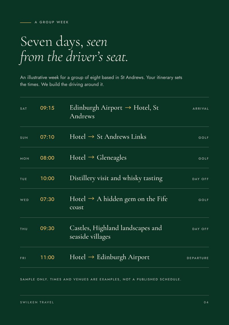
A black Sprinter will be at arrivals for 07.40, with room for eight and their clubs.
We do not write
Experience unparalleled luxury transfers with our world class team!

The crest

One crest, everywhere we appear.

A roundel was chosen because it is the shape of a club badge, a wax seal and the emblem on a coach door. It holds together at any size, it stitches and foils cleanly, and it never needs a background panel to sit on.

SWILKEN TRAVELST ANDREWS · SCOTLAND
The bridge
The Swilken Bridge, drawn as it is built, with a single arch, a ring of arch stones and coursed stonework under the parapet. It is the reason for the name and the centre of the crest.
The flag and the ground
A pin flag on the far bank and the lie of the links either side of the bridge. They place the bridge on the course.
The burn
Two lines of water beneath the arch. They show that the bridge is crossing something.
The name
Swilken Travel in spaced capitals on the upper arc, set like the lettering on a club badge.
The home town
St Andrews and Scotland on the lower arc. Where we are from is half of what we offer.
The rings
One firm outer ring with fine rings inside it, the way a seal or a coach roundel is drawn.

The three colourways

SWILKEN TRAVELST ANDREWS · SCOTLAND
Gold on links green

The first choice. Covers, uniform and site headers.

SWILKEN TRAVELST ANDREWS · SCOTLAND
Gold on coach black

Vehicles, leather goods and evening pieces.

SWILKEN TRAVELST ANDREWS · SCOTLAND
Links green on ivory

Paper, stationery and light cloth.

With the name

SwilkenTravel
Name alongside, for headers and vehicle sides
SwilkenTravel
Name beneath, for covers and cards

Using it

  • Clear space

    Keep a margin of at least one quarter of the crest's width on every side. Nothing enters it, including borders, photographs and other lettering.

  • Smallest size

    With its lettering, the crest is never smaller than 18mm in print or stitch, or 48 pixels on screen. Below that the lettering closes up.

  • Very small uses

    For a browser tab or an app icon, the rings, bridge, flag and burn are used without the lettering. It is the same crest, simplified so it stays sharp.

  • The name alongside

    Where the name must be read from a distance, it sits beside or beneath the crest in Cormorant Garamond. It never appears as a logo without the crest.

We never

  • Recolour the crest outside the three colourways.
  • Use the bridge by itself as a logo.
  • Stretch, tilt, outline or add a shadow.
  • Place it on a busy photograph without a dark scrim.
  • Redraw the lettering in another typeface.
  • Let a border or edge cut through it.

The bridge repeat

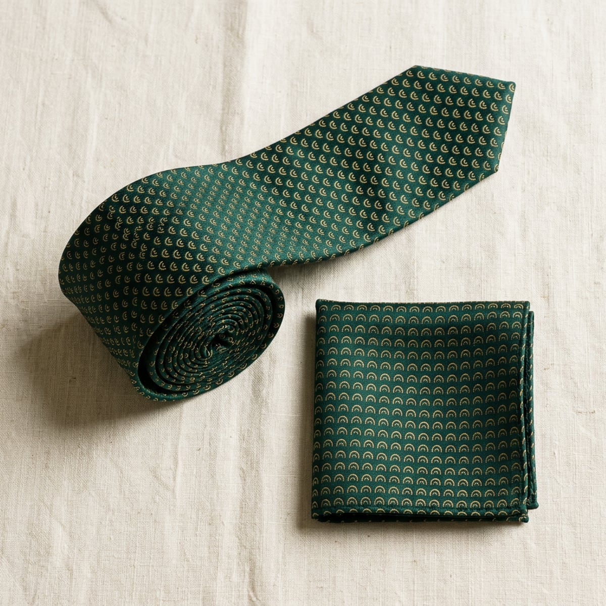
The bridge from the centre of the crest, set in a half drop, in the manner of a woven silk tie. It is a pattern and never a logo. It is used for linings, the tie and pocket square, and the foot of each page on this site, always at low contrast so it reads as texture.

The colours

Five colours, all found on the links.

Nothing in the palette was picked from a chart. Each colour is something a guest will see during the week, from the turf and the sand to the paper in their hand and the vehicle at the kerb. That is why the palette feels settled, and why it stays small.

  • Links green

    The lead colour. Covers, uniform, dark panels.

    Hex
    #0A3423
    RGB
    10 52 35
    CMYK
    81 0 33 80

    The green of a fairway in the last hour of light, deep enough to sit beside black. It is the colour of club blazers and waxed jackets, so it reads as golf and as Scotland before a word is read. A brighter green would look like a garden centre.

  • Livery gold

    The crest, thread, foil and fine rules.

    Hex
    #D4AF5D
    RGB
    212 175 93
    CMYK
    0 17 56 17

    A soft, slightly aged gold, closer to brass fittings and the hand painted lining on a coach than to jewellery. It is kept muted on purpose. Bright yellow gold looks like a prize draw, and this should look like something that has been polished for years.

  • Coach black

    Text, the footer, the vehicles.

    Hex
    #0B1712
    RGB
    11 23 18
    CMYK
    52 0 22 91

    Our vehicles are black, so black is already the colour guests meet first. This one carries a trace of green, which lets it sit next to links green without the two fighting, and makes long text softer to read than pure black.

  • Ivory

    Paper and page background.

    Hex
    #F8F6ED
    RGB
    248 246 237
    CMYK
    0 1 4 3

    The colour of a scorecard or a sheet of uncoated writing paper. Brilliant white feels like office print. Ivory feels like something that was chosen, and it lets the green and gold look richer.

  • Bunker sand

    Quiet panels and dividing rules.

    Hex
    #EDEADC
    RGB
    237 234 220
    CMYK
    0 1 7 7

    One step down from ivory, named for the pale sand in a links bunker. It separates sections without a hard line, so a page can change subject without changing mood.

CMYK values are a starting point converted from the screen colours. Thread, foil and spot ink references should be matched by the maker against a printed proof of this page and approved before a full run.

The colourways

The colours are only ever combined in four ways. Each has a job, and each has been checked for legibility. The figure is the contrast ratio, where 4.5 to 1 is the accepted minimum for reading text.

  • Clubhouse

    6.6 to 1

    Gold on links green

    The signature. Front covers, the uniform, site headers and anything a guest sees first.

  • Coachwork

    8.8 to 1

    Gold on coach black

    Vehicle livery, leather bag tags, the footer and anything used after dark.

  • Letterhead

    12.7 to 1

    Links green on ivory

    Stationery, itineraries, invoices, light cloth and one colour print.

  • Scorecard

    15.2 to 1

    Coach black on bunker sand

    Long reading. Body copy, tables and schedules, with gold kept to a single rule.

How much of each

  • 60%Ivory and sand
  • 28%Links green
  • 9%Coach black
  • 3%Livery gold

Across any piece, pale paper does most of the work, green carries the weight and black is for reading. Gold is the smallest share by a long way.

That scarcity is the point. Gold reads as valuable only when there is very little of it, so it is kept for the crest, a hairline rule or a single button. It is never used as a background, and never for text on ivory, where it is too pale to read.

The type

Two typefaces, one to speak and one to inform.

The pairing follows the oldest habit in fine print. A serif with real character carries the few words that matter, and a plain sans serif carries everything a guest needs to act on.

Aa Gg

Cormorant Garamond

Headlines and the name. Light, Light Italic and Medium.

A display serif in the Garamond tradition, with fine hairlines, long ascenders and a graceful italic. It has the look of an engraved invitation or club stationery, which is the company we want to keep.

Those hairlines only hold up when the type is large and has room, so it is kept for headlines and never used for small print. Setting it light rather than bold is what makes it feel expensive.
Aa Gg

Jost

Reading text, labels and crest lettering. Regular and Medium.

A geometric sans serif modelled on the German designs of the 1920s. Its round, even letters are easy to read in a pick up time or a phone number, where a mistake costs somebody a tee time.

In spaced capitals it looks like the lettering on an honours board or an engraved plate. That is why it is used around the crest and for every small label.

The styles

  • Headline

    Cormorant Garamond Light, tight spacing, line height 1 to 1.05

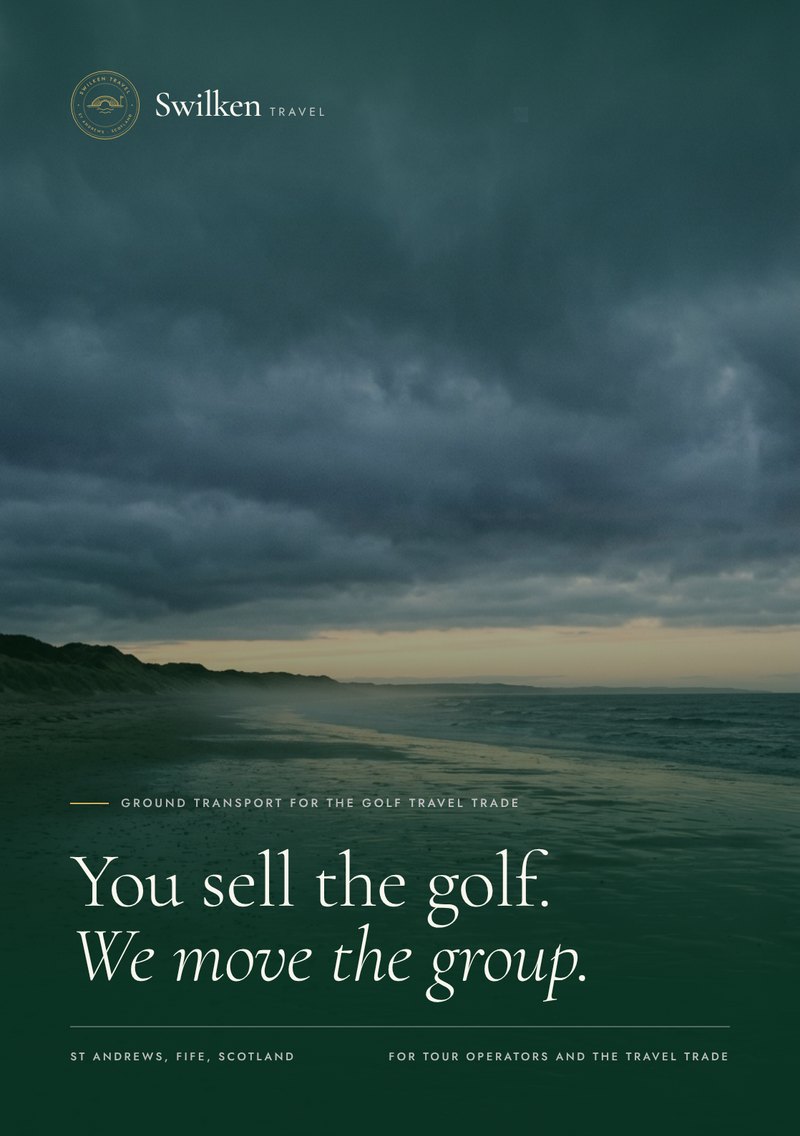
    You sell the golf.

  • Headline emphasis

    Cormorant Garamond Light Italic, for the second half of a headline only

    We move the group.

  • The name in the logo

    Cormorant Garamond Medium, beside or beneath the crest

    Swilken

  • Reading text

    Jost Regular, 16 to 20 pixels on screen, 9 to 10 point in print, line height 1.6

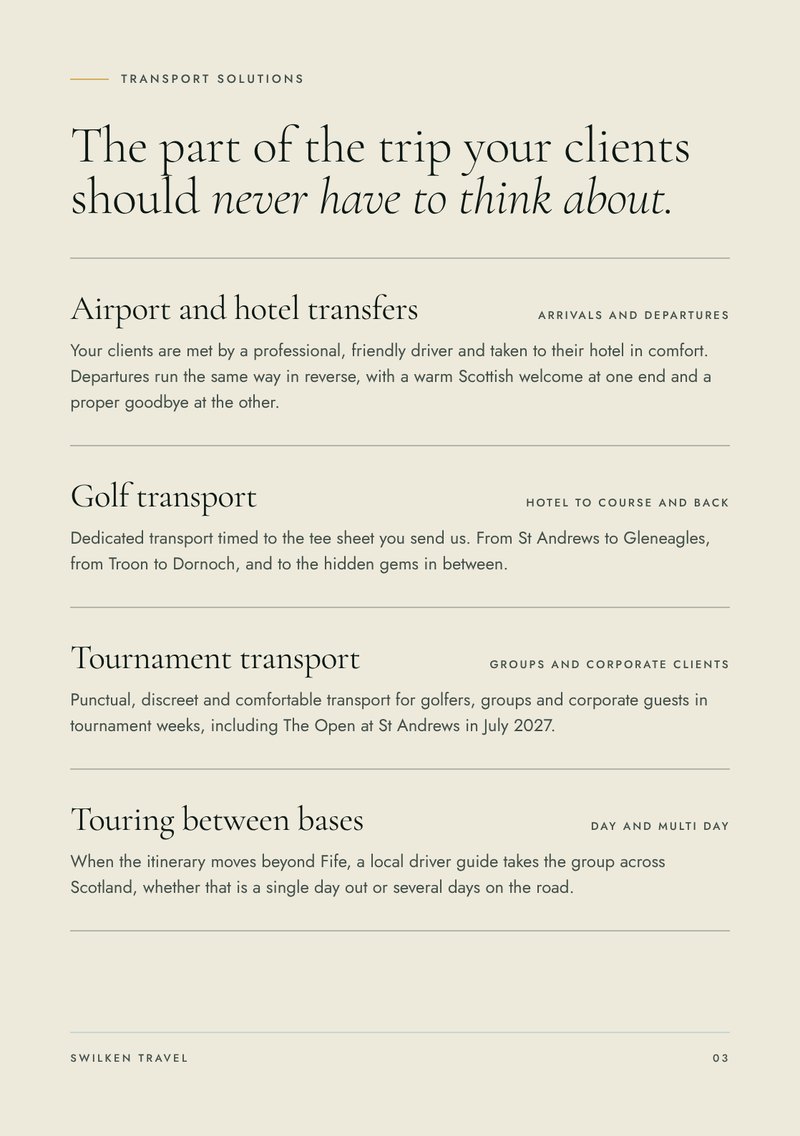
    Airport arrivals, golf transport and days off, driven by local driver guides.

  • Labels

    Jost Regular in capitals, 12 pixels, letter spacing 0.18 to 0.34 em

    St Andrews, the home of golf

  • Crest lettering

    Jost Medium in capitals, set on the curve

    Swilken Travel

Setting it

  • Two families only. A third typeface is never introduced, on any piece.
  • Headlines are always light. Bold serif type is not used anywhere.
  • Italic is for the turn in a headline, not for emphasis in running text.
  • Capitals are for Jost labels only, always with open spacing. The serif is never set in capitals.
  • Reading text is never smaller than 14 pixels on screen or 8 point in print.
  • Text is set left, with a ragged right edge. Only covers and the crest are centred.

The wardrobe

What the driver wears, and what the guest takes home.

Twenty three pieces in links green, coach black and livery gold, grouped by where they turn up during the week. These are mock ups for approval, so sizes, thread colours and placements can all be changed before anything is ordered.

The driver

Nine pieces

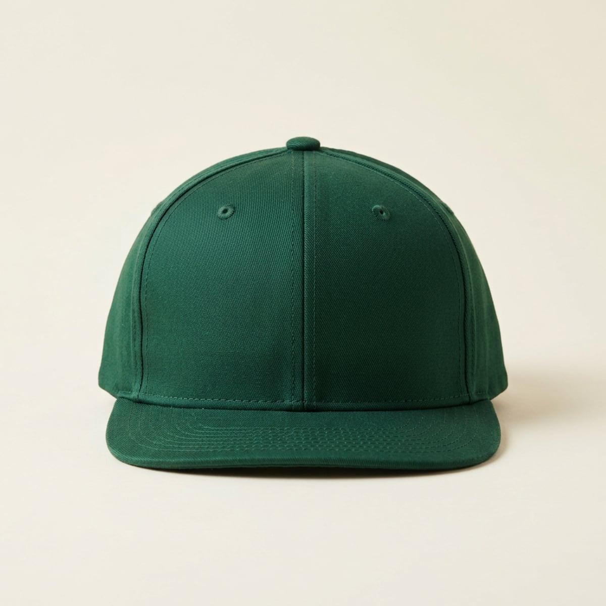
Links green golf cap with the Swilken Travel crest embroidered in gold on the front
The capLinks green cotton twill with the crest embroidered in gold thread on the front panels.
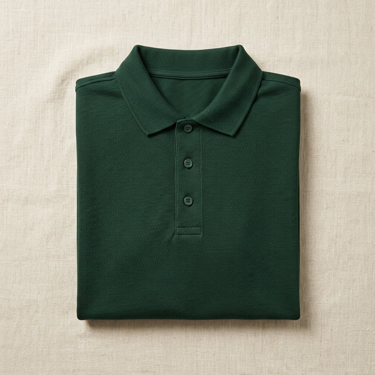
Folded links green polo shirt with the Swilken Travel crest stitched in gold on the chest
The poloPique cotton in links green, with the crest stitched in gold on the left chest.
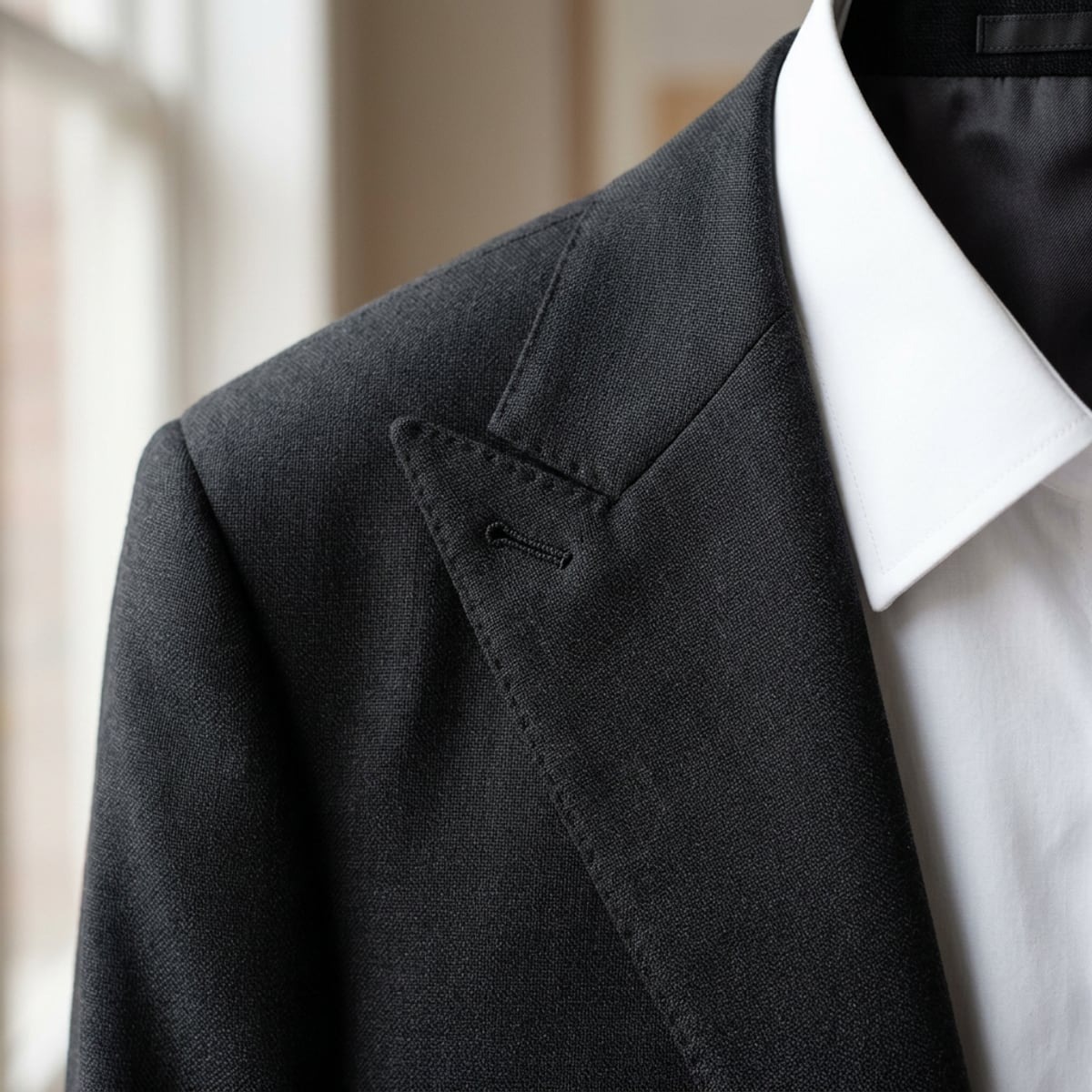
Charcoal jacket lapel wearing a round green and gold Swilken Travel crest pin
The lapel pinHard enamel, 22mm, the crest in gold on links green. Worn on every driver guide's jacket.
Rolled silk tie and folded pocket square in green, woven with a repeat of small gold bridges
The tie and pocket squareWoven silk in the bridge repeat, gold on links green. The same pattern runs through our print.
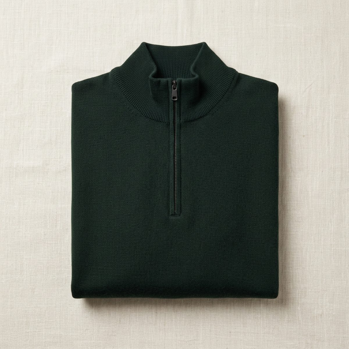
Folded links green quarter zip sweater with the Swilken Travel crest stitched in gold on the chest
The quarter zipMerino knit in links green for the cooler tee times, with the crest in gold on the left chest.
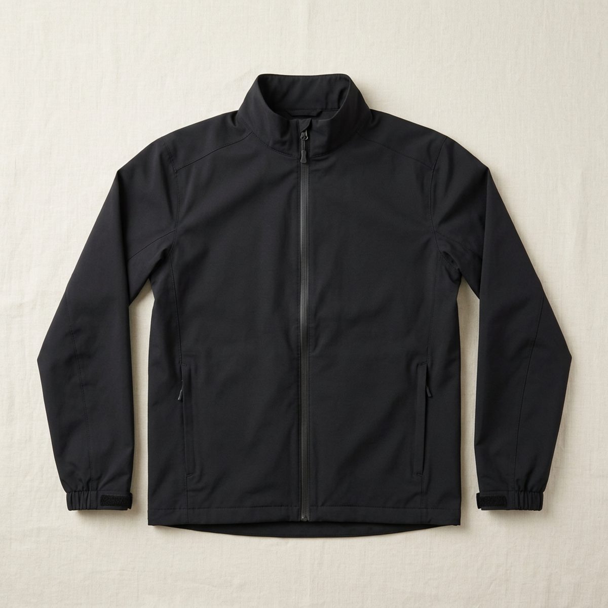
Black waterproof jacket with the Swilken Travel crest stitched in gold on the chest
The waterproofCoach black shell for loading clubs in the rain, with the crest in gold on the left chest.
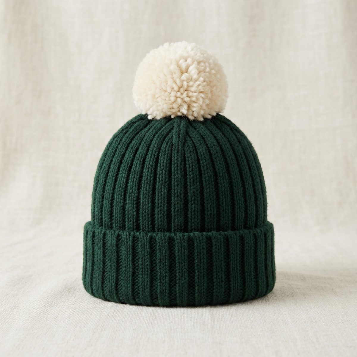
Links green wool bobble hat with a cream pom pom and the Swilken Travel crest in gold on the cuff
The bobble hatRibbed lambswool with a cream bobble and the crest in gold on the cuff. For the winter diary.
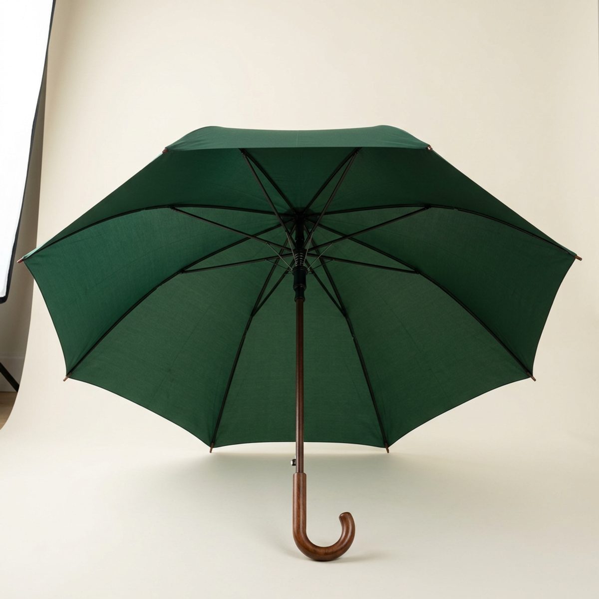
Open links green golf umbrella with a wooden handle and the Swilken Travel crest in gold on one panel
The umbrellaLinks green canopy with the crest on one panel and a wooden crook handle. Held at the kerb for every guest.
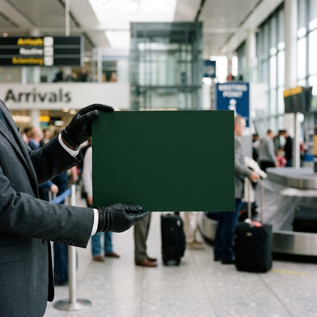
Driver in a charcoal suit holding a links green greeting board with the Swilken Travel crest at airport arrivals
The greeting boardThe crest above the group name, held at arrivals. The operator's name can sit beneath it.

In the vehicle

Four pieces and the livery

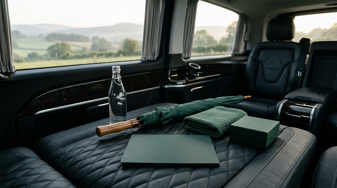
Welcome kit laid out on a black leather minicoach seat: a green folder, a furled green umbrella, a bottle of water, a folded towel and a small green box
The welcome kitWhat is waiting on each seat at the airport: the welcome folder, an umbrella, a bottle of water, a towel and the ball box.
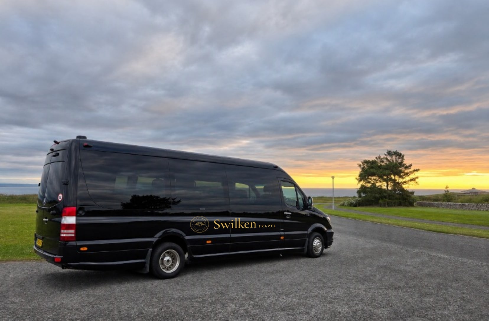
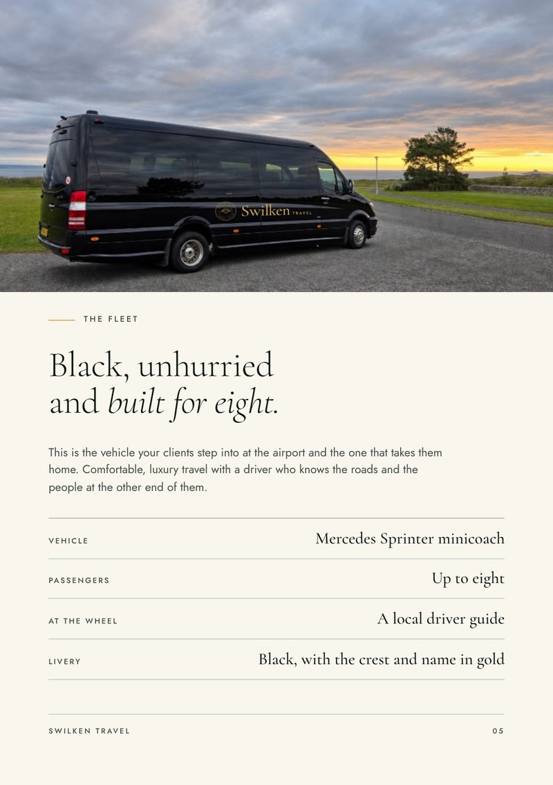
Black Mercedes Sprinter minicoach carrying the Swilken Travel crest and name in gold
The liveryThe crest and name in gold on the lower panel of the Sprinter.
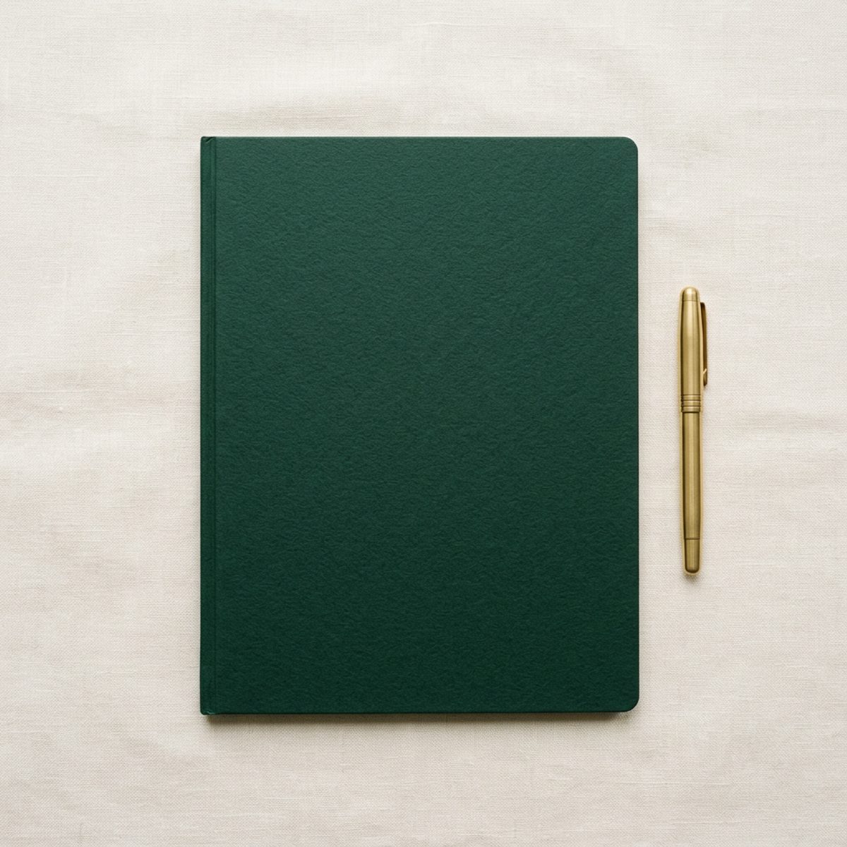
Links green card folder with the Swilken Travel crest foiled in gold on the cover, beside a brass pen
The welcome folderThe week's itinerary, tee times and the driver's number, in a green card folder with the crest foiled in gold.
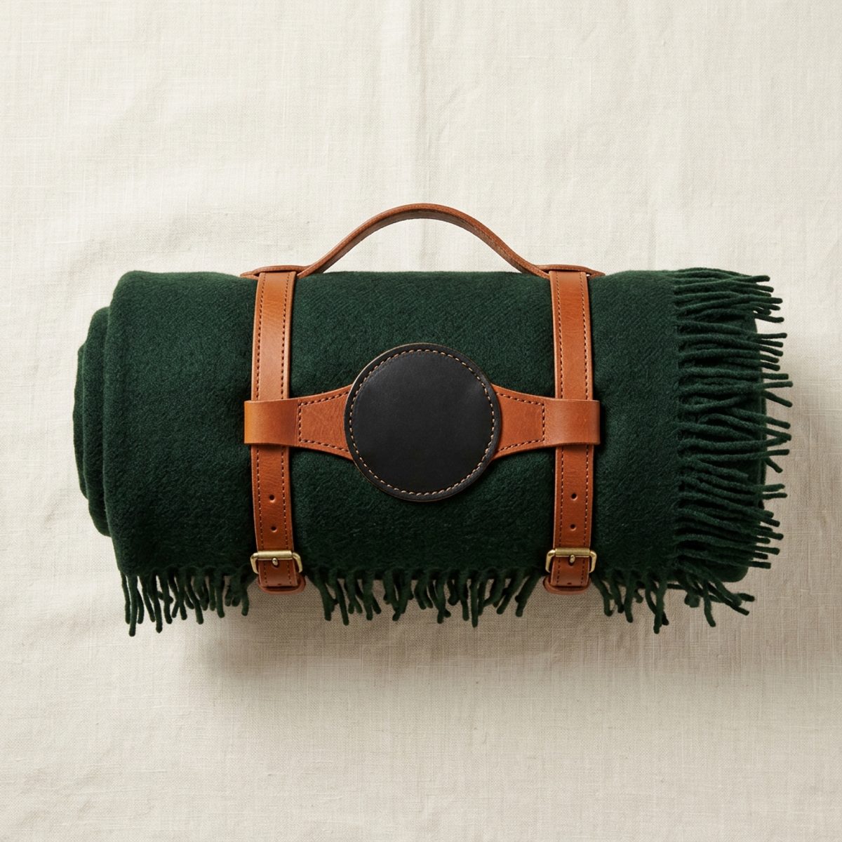
Rolled links green wool travel rug in a tan leather strap with the Swilken Travel crest in gold on a black leather patch
The travel rugLambswool in links green with a tan leather carrying strap and the crest foiled on the patch.
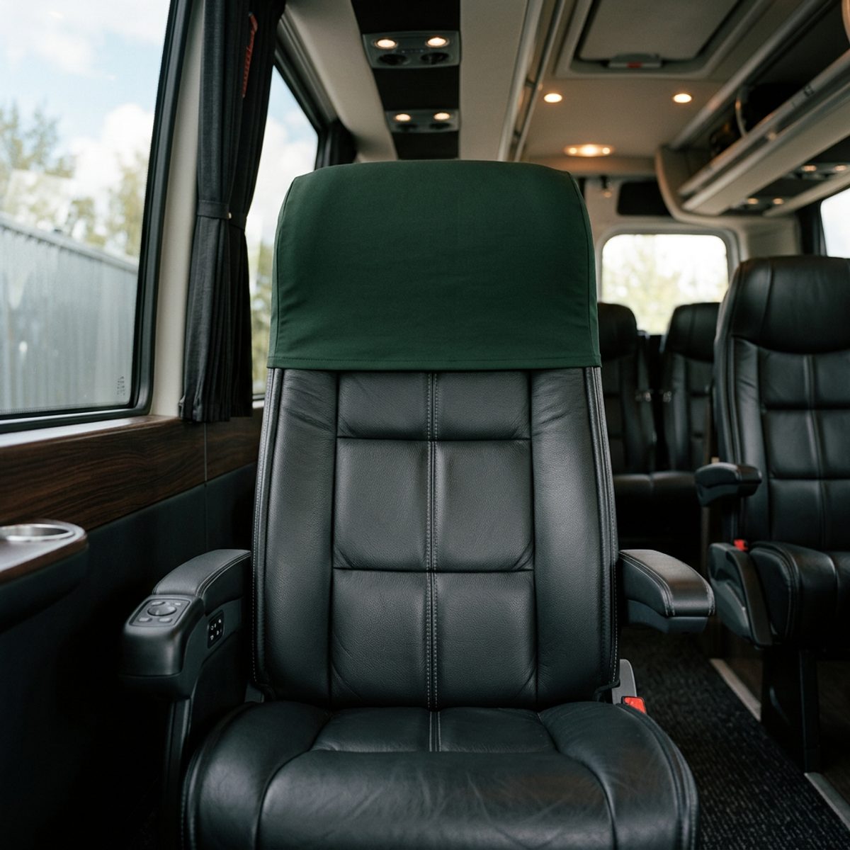
Black leather minicoach seat with a links green headrest cover carrying the Swilken Travel crest in gold
The headrest coverLinks green cotton with the crest stitched in gold, on every seat in the Sprinter.
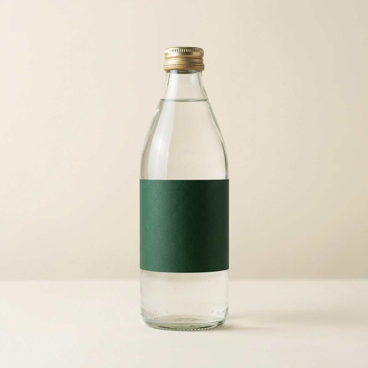
Glass bottle of still water with a links green label printed with the Swilken Travel crest in gold
The waterStill Scottish water in glass with a green label and the crest in gold. Chilled and waiting in each seat.

What the guest takes home

Ten pieces

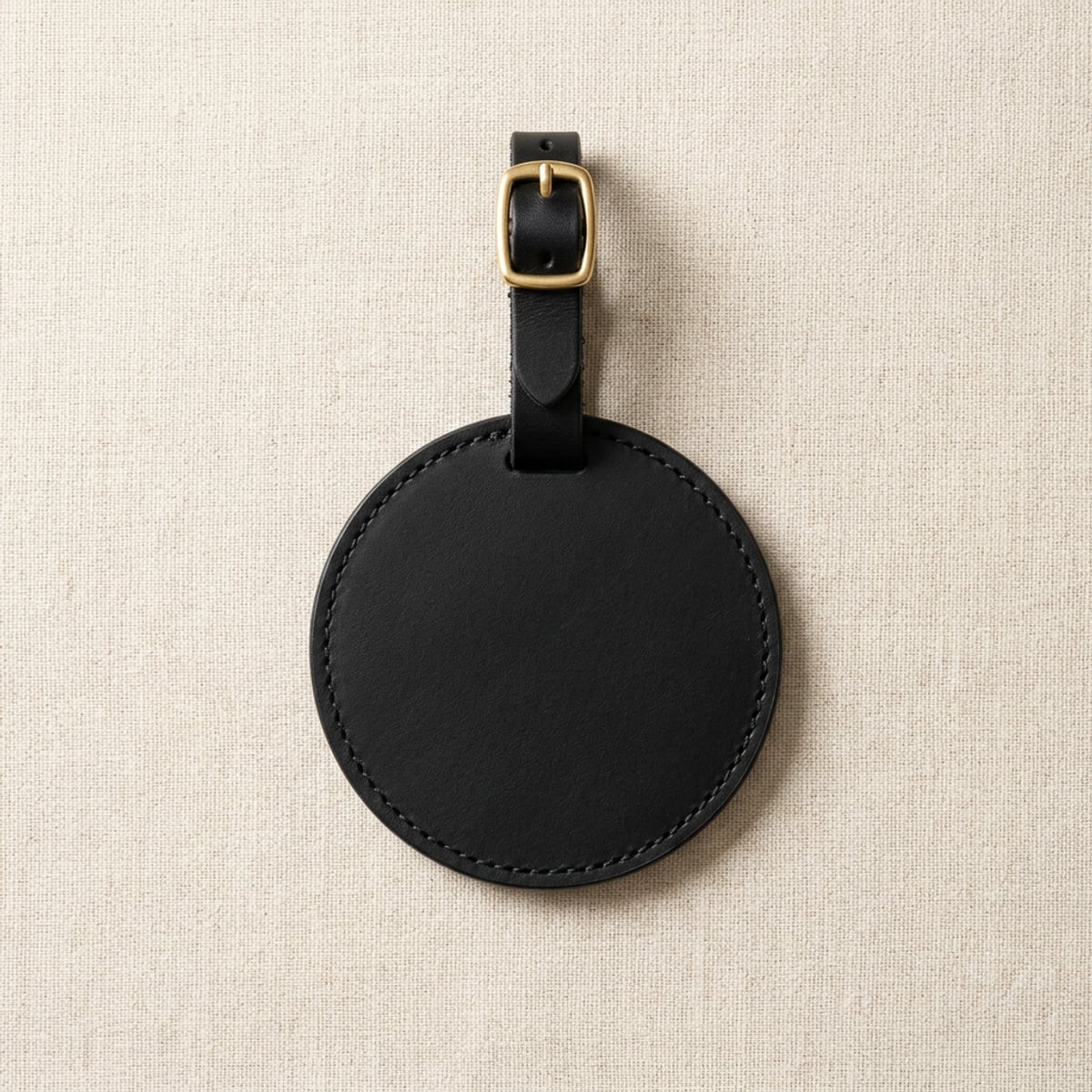
Round black leather bag tag with a brass buckle and the Swilken Travel crest foiled in gold
The bag tagBlack leather with a brass buckle and the crest foiled in gold. The back is engraved with the guest's name and the courses they played.
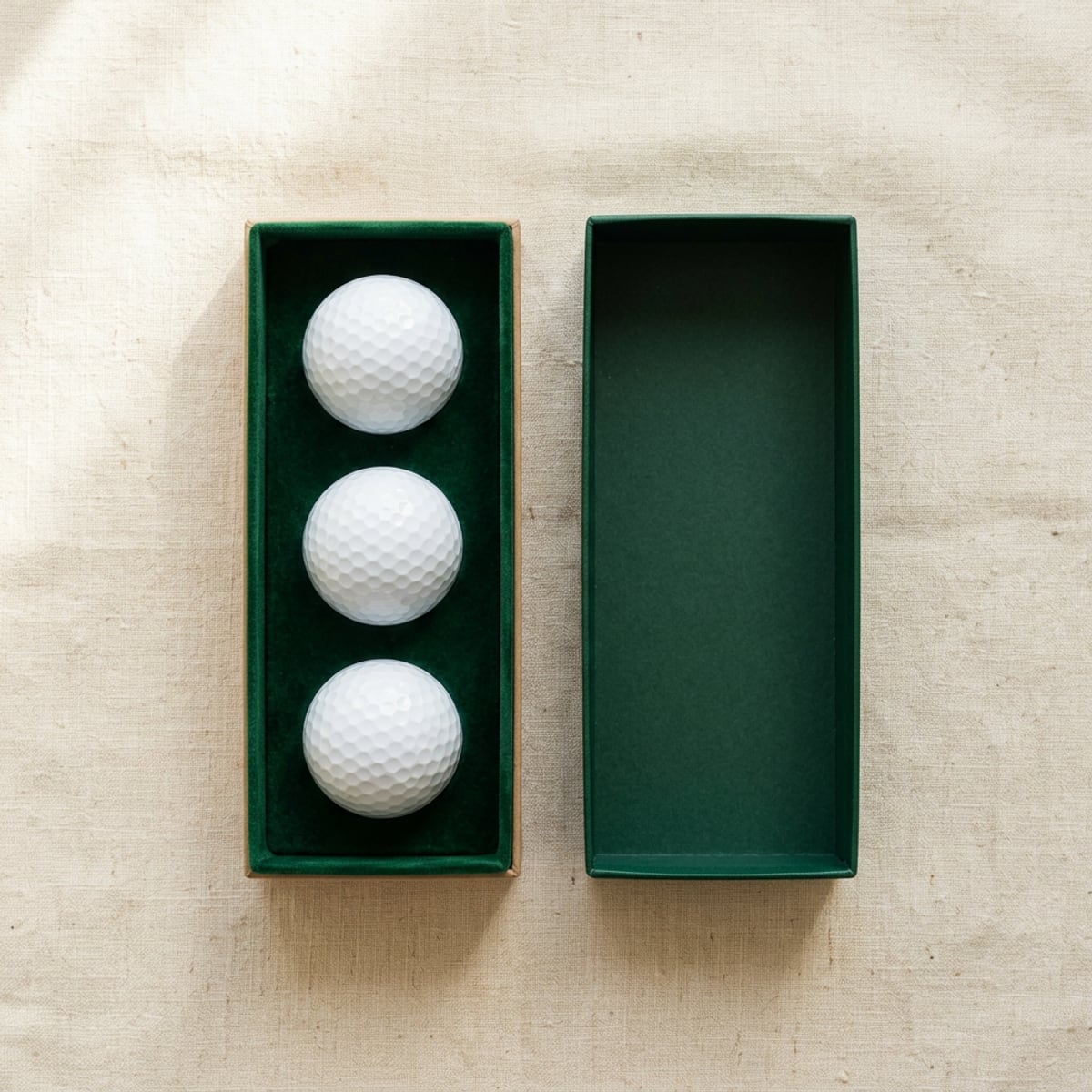
Green presentation box holding three golf balls, each printed with the Swilken Travel crest
The ball boxThree balls printed with the crest in a green presentation box. A welcome gift on arrival.
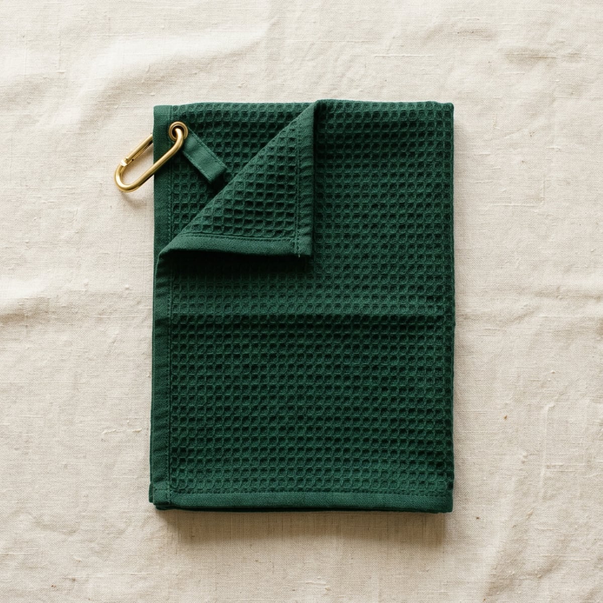
Green waffle golf towel with a brass clip and the Swilken Travel crest embroidered in gold
The caddie towelWaffle cotton with a brass clip and the crest in gold thread on the lower corner.
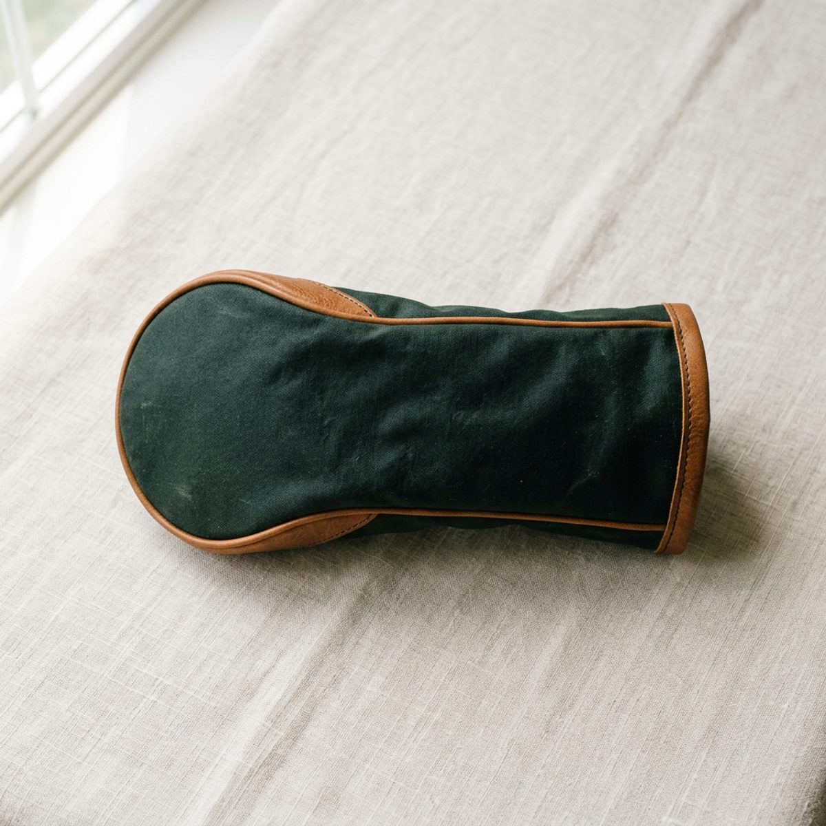
Links green waxed cotton driver headcover with tan leather trim and the Swilken Travel crest stitched in gold
The headcoverWaxed cotton in links green with tan leather piping and the crest stitched in gold.
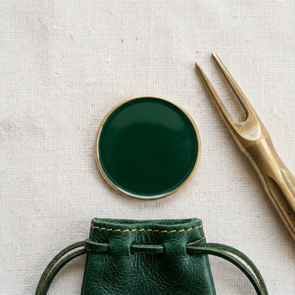
Green enamel and brass ball marker carrying the Swilken Travel crest, with a brass pitch mark repairer and a green leather pouch
The marker and repairerThe crest in brass on green enamel, with a solid brass pitch mark repairer in a leather pouch.
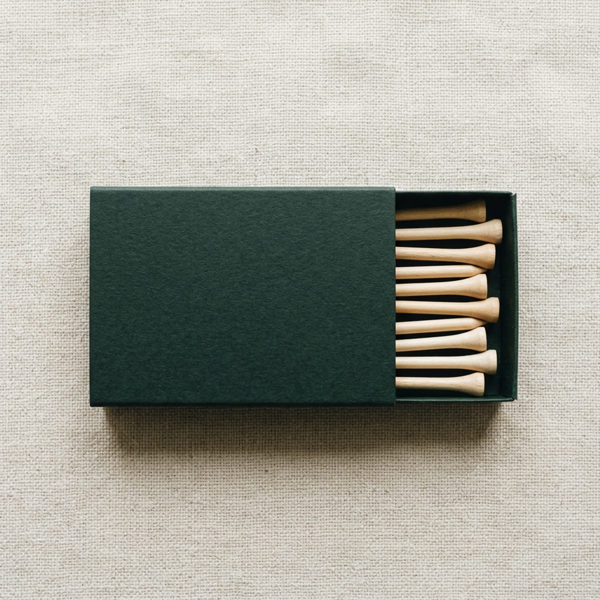
Links green matchbox style sleeve of wooden golf tees with the Swilken Travel crest in gold on the lid
The teesWooden tees in a matchbox sleeve, with the crest foiled in gold on the lid.
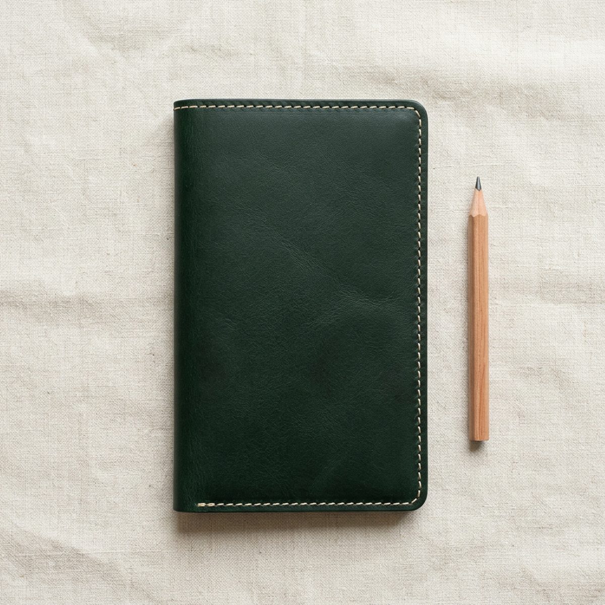
Links green leather scorecard holder with the Swilken Travel crest foiled in gold, beside a pencil
The scorecard holderGreen leather with cream stitching, the crest foiled in gold and a pencil in the spine.
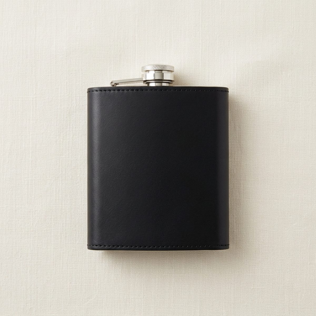
Black leather hip flask with a steel cap and the Swilken Travel crest foiled in gold
The hip flaskSteel wrapped in coach black leather with the crest foiled in gold. The gift at the end of the week.
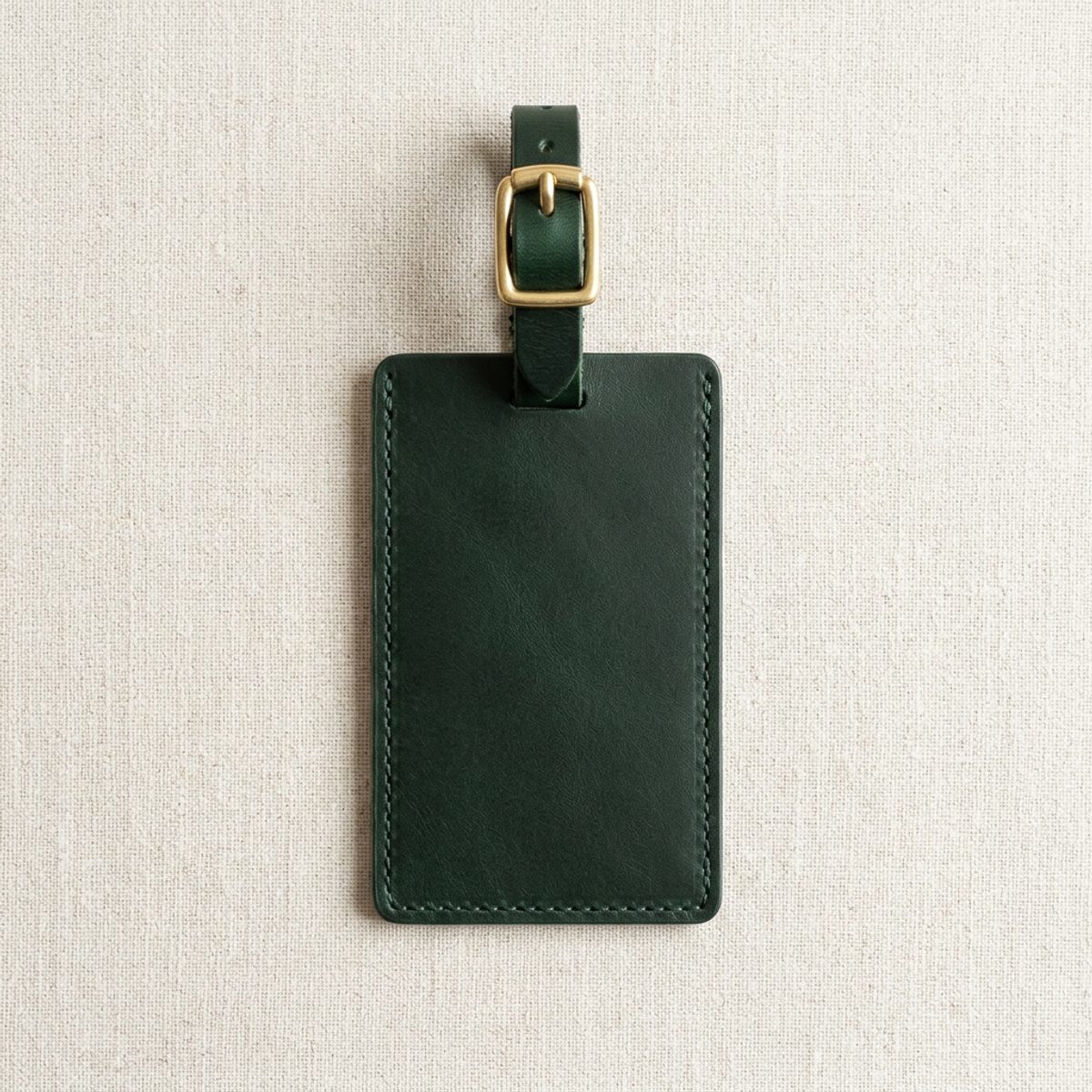
Links green leather luggage tag with a brass buckle and the Swilken Travel crest foiled in gold
The luggage tagGreen leather with a brass buckle, for club travel covers. Sent to the operator before the group flies.
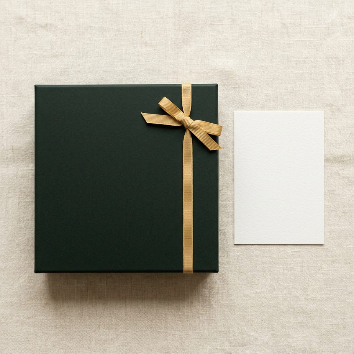
Links green gift box with a gold ribbon and the Swilken Travel crest foiled in gold on the lid, beside an ivory card
The operator's gift boxAn end of season thank you for the operator: the marker, the flask and a handwritten card.

In print

The pieces we hand over, ready to download.

The trade booklet and the business card, built from the same colours and type as everything else here. Each comes as a print file to send to the printer and a screen file to attach to an email.

Before anything goes out

Five checks, every time.

Whether it is a jacket, a vehicle wrap or a single page PDF, it should pass all five before it carries our name.

  • The crest is complete, in one of its three colourways, with clear space around it.
  • No colour appears that is not in the palette, and gold covers no more than a sliver of the piece.
  • Headlines are Cormorant Garamond set light. Everything else is Jost. There is no third typeface.
  • The copy names the vehicle, the place and the time, and promises nothing we cannot deliver.
  • The material and finish are named, so the maker is not left to guess.